To use the State Dashboards:
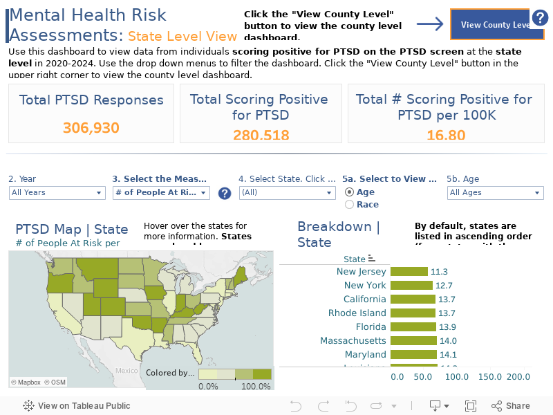
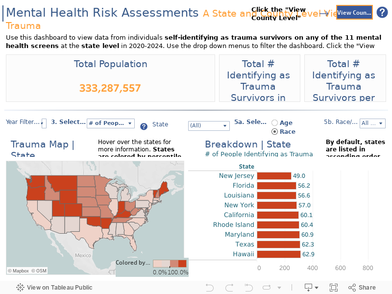
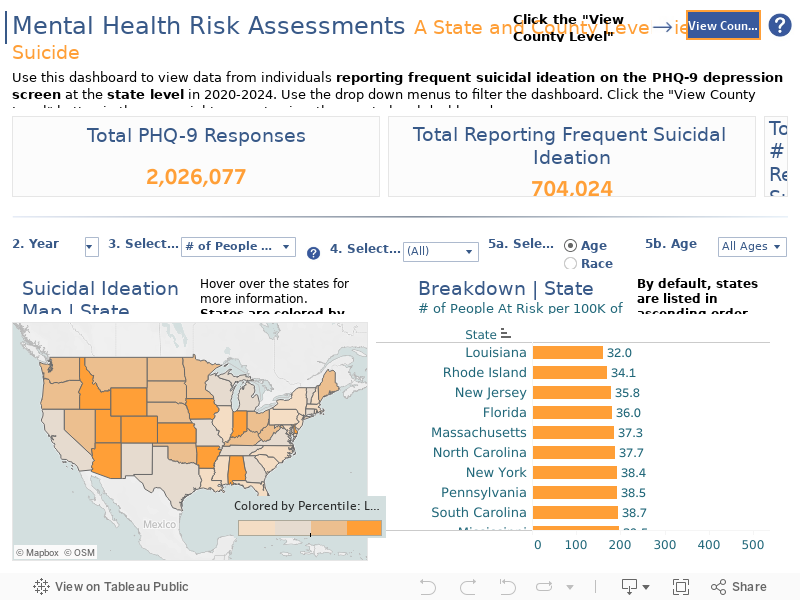
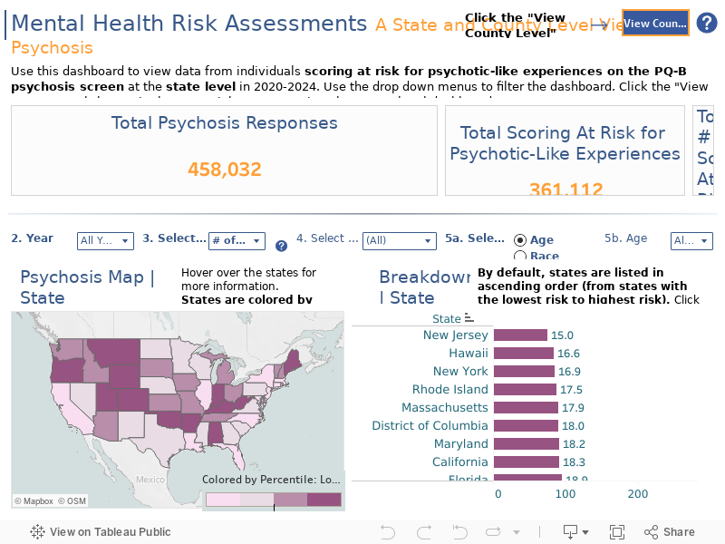
- Select the condition (Depression, Suicide, PTSD, Trauma or Psychosis) you are interested in exploring on the blue buttons above the dashboard. Once you select a condition, the dashboard will open to the State Level view. If you would like to view County level data, click the “View County Level” button to the left of the X.
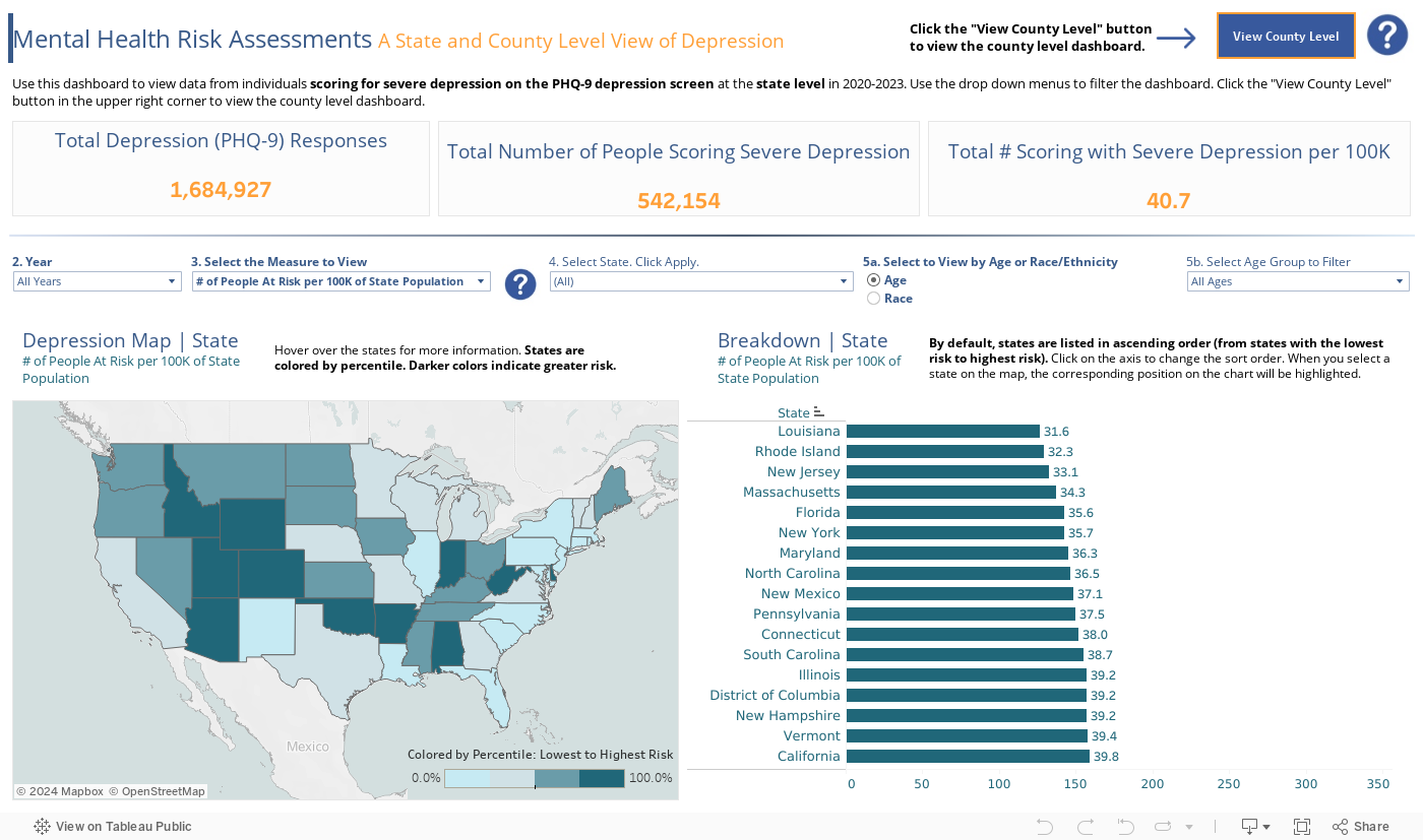
- Select the Year (2020, 2021, 2022, 2023, or All Years) you would like to view on the “Year” drop-down list.
- Select the measure you would like to view. You can either view data on the number of people scoring at risk per 100,000 people in the state population, or the percentage of people scoring at risk of the people who took a screen on MHA Screening. For more information, click the question mark icon next to the “Select the Measure to View” drop-down list.
- Use the “State” drop-down list to select or search states. Once the states you want to view are selected, click Apply at the bottom of the list to filter the map and bar graph.
- You can view the data by age group or by race/ethnicity. To view the data by age group, click the bubble next to “Age,” and you will see a filter to the right labeled “Age.” To view the data by race/ethnicity, click the bubble next to “Race/Ethnicity,” and you will see a filter to the right labeled “Race/Ethnicity.”
- Age: Use the “Age” drop-down list to view the state level data by age group. You can either view data for Adults (Over 18), Youth (Under 18), All Ages, or No Age Information Provided (which includes data from individuals who did not answer the Age demographic question when taking a screen.
- Race/Ethnicity: Use the “Race/Ethnicity” drop-down list to view the state level data by race/ethnicity. You can view data for screeners who identified as American Indian or Alaska Native, Asian or Pacific Islander, Black or African American (non-Hispanic), Hispanic or Latino, White (non-Hispanic), or More than one race.
- To reset your views and/or clear selections, click the Reset button at the bottom of each dashboard.

To use the County Dashboards:
- Select the condition (Depression, Suicide, PTSD, Trauma or Psychosis) you are interested in exploring on the blue buttons above the dashboard. Once you select a condition, the dashboard will open to the State Level view. If you would like to view County level data, click the “View County Level” button to the left of the X. When you are on the County dashboard, click the “View State Level” button to the left of the X to navigate to the state level dashboard.
- Select the Year (2020, 2021, 2022, 2023, or All Years) you would like to view on the “Year Filter” drop-down list.
- Filter down to a state or county using the drop-down lists to the right.
- Use the State drop-down list to select states you would like to view. Once states are selected, click Apply at the bottom of the list to filter the map and bar graph. This filter will change the map and bar graph to show only counties within the selected states. It will also recalculate the percentiles, so counties will be color coded from lowest to highest risk compared to other counties in the selected states (not in comparison to all counties in the U.S.).
- Use the County drop-down list to select or search individual counties. Once counties are selected, click Apply at the bottom of the list to filter the map and bar graph.
- To reset your views and/or clear selections, click the Reset button at the bottom of each dashboard.
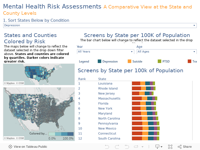
To use the Dashboard on the “Comparison” Map:
- Use the drop-down filter titled “Sort States Below by Condition” to choose the condition you are interested in exploring. When a condition is selected the states in the bar view are re-ordered. States are presented in ascending order, from the state with the lowest number of individuals per 100K population scoring at risk for that condition to the states with the highest number of individuals per 100K population scoring at risk.
- On the “Screens by State per 100K of Population” bar view, the data can also be viewed by year. Use the “Year” drop-down list to select the Year you would like to view (2020, 2021, 2022, 2023, or All Years). Use the “Age” drop-down list to select the Age group you would like to view (Adults, Youth, No Age Information Provided, or All Ages).
- Note that the “Year” and “Age” filters only control the bar view and the state map. The county map shows the number of individuals scoring at risk per 100K population for all years and ages.
For more information on the data and methodology used to create the dashboard, visit the Methodology page.